


BUNKDAT (ROOMMATE FINDING APP
UX/UI DESIGN
ROLE
LOGO DESIGNERUI DESIGNERUX RESEARCHERTEAM MEMBERS
MAGGIE KARMANINAKUNSELLAYEJI3 MONTHDURATION
(user: college students) needs to (user needs: reliable ways to find roommates on campus) because (insight: finding roommates on social media can be a bit skeptical and finding one with similar life patterns can be hard.)PROBLEM STATEMENT
BunkDat is a platform that facilitates the process of finding apartments and roommates, particularly geared towards recently graduated students who are searching for roommates in unfamiliar areas.CONTEXT
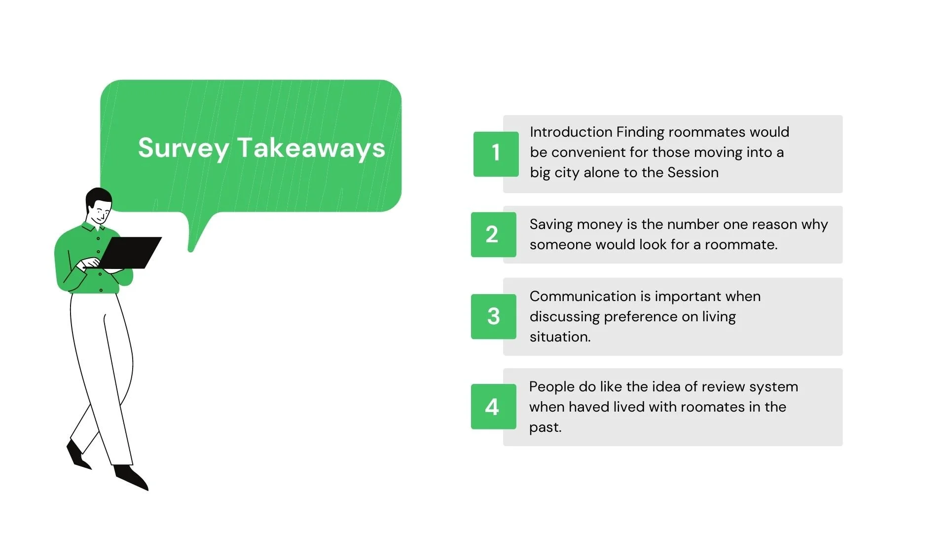
SNEAK PEAK


RESEARCH
Finding the perfect rooms and roommatesAbout 54% of the world's population lives in cities or urban communitiesThe average marriage age for men is 29 and women is 27People who tend to move are mostly in their twenties and singleMany of these people are the working class and are always on the hunt for better accommodations and good roommatesSome people choose to live with roommates for companionship. This comes from complex social dynamicsThere are a few things on the market, but not all in one complete solutionPeople in the target age group and working in tier 1, and 2 cities would prefer living in shared accommodation to reduce financial stress
The impact of roommates on first-year students:Students with roommates were more likely to rate themselves as highly committed than those without roommates by 5%4% more students with roommates were again likely to rate themselves as highly satisfied8% of students with no roommates report high homesickness distress
More adults now share their living space, driven in part by parents living with their adult childrenIn 2017, nearly 79 million adults (31.9% of the adult population) lived in a shared household -that isPeople tend to move in with their family if they can


MOODBOARD


BUNKDAT LOGO
I'm excited about the prospect of designing a logo that truly captures the essence of what BunkDat is all about. t's essential that the logo is not only visually appealing but also conveys the core purpose of the app. That's why I've decided to use the letter "b" to represent a home, which is at the heart of what my app does. I believe that a logo that visually depicts what the app is all about can be a powerful tool in attracting potential users.